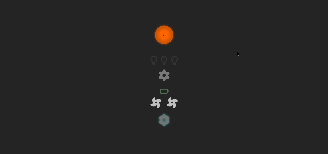
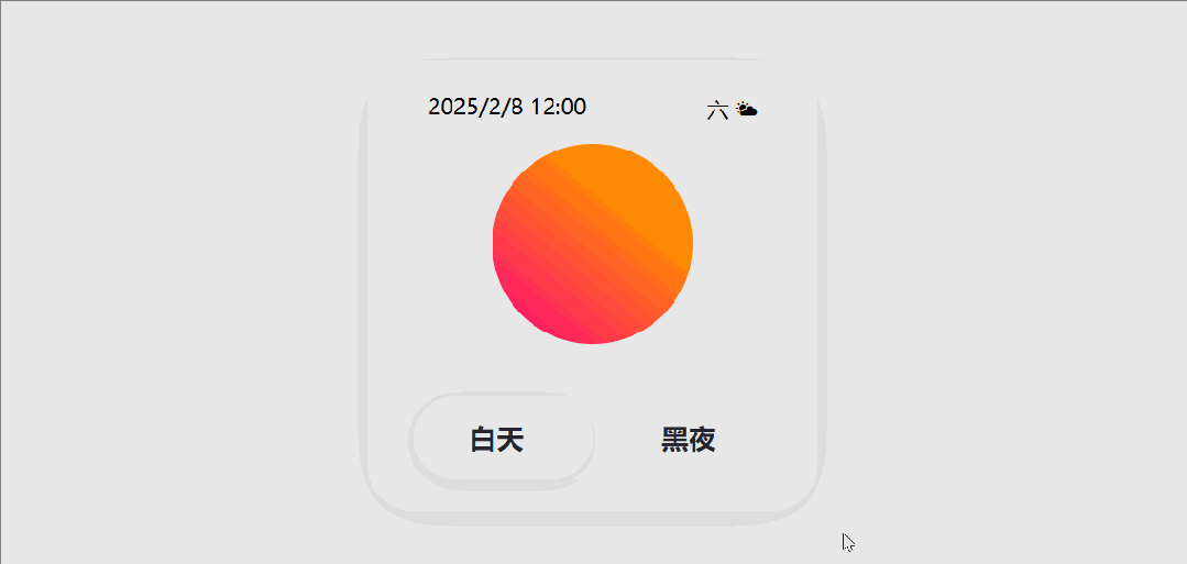
这段代码是一个 HTML 页面,它包含 CSS 样式和一个简单的开关(toggle)功能,用于在“白天”和“黑夜”模式之间切换。页面显示了一个带有时间、日期和天气信息的卡片,以及一个圆形的背景。
演示效果
HTML&CSS
<!DOCTYPE html>
<html lang="en">

<head>
    <meta charset="UTF-8">
    <meta name="viewport" content="width=device-width, initial-scale=1.0">
    <title>公众号关注:前端Hardy</title>
    <style>
        body {
            margin: 0;
            padding: 0;
            background: #e8e8e8;
            display: flex;
            align-items: center;
            justify-content: center;
            height: 100vh;
        }

        .app {
            --light-col: #e8e8e8;
            --dark-col: #26242e;
            display: flex;
            flex-direction: column;
            box-shadow: 04px35pxrgba(0, 0, 0, 0.1);
            position: relative;
            z-index: 1;
            width: 18rem;
            height: 18rem;
            background-color: #e8e8e8;
            border-radius: 30px;
            overflow: hidden;
            user-select: none;
        }

        .app::before {
            --dimension: 50px;
            content: "";
            width: var(--dimension);
            height: var(--dimension);
            border-radius: 50%;
            background: #26242e;
            position: absolute;
            top: calc(50% - (var(--dimension) / 2));
            left: calc(50% - (var(--dimension)) / 2);
            display: block;
            box-shadow: 0px0px00pxvar(--dark-col);
            z-index: -1;
            transition: 400ms ease-out;
        }

        nav {
            display: flex;
            justify-content: space-around;
            padding: 20px00;
            width: 100%;
        }

        .time {
            font-size: 14px;
        }

        .wet {
            font-size: 14px;
        }

        .week {
            font-size: 14px;
        }

        .circle {
            position: relative;
            border-radius: 100%;
            width: 8rem;
            height: 8rem;
            background: linear-gradient(40deg, #ff0080, #ff8c00 70%);
            margin: auto;
        }

        .circle::before {
            content: "";
            position: absolute;
            border-radius: 50%;
            right: 0;
            width: 6rem;
            height: 6rem;
            z-index: 1;
            background: var(--bg);
            transform: scale(0);
            transform-origin: top right;
            transition: 450ms;
        }

        label {
            width: auto;
            margin: 20px30px;
            padding: 15px35px;
            background-color: rgba(255, 255, 255, 0.1);
            border-radius: 50px;
            position: relative;
            cursor: pointer;
            font-size: 1.1rem;
            font-weight: bolder;
            color: var(--dark-col);
            display: flex;
            justify-content: space-between;
        }

        label::before {
            content: "";
            position: absolute;
            width: 50%;
            inset: 0;
            border-radius: inherit;
            display: block;
            z-index: -1;
            background-color: #fff;
            -webkit-box-shadow: 02px15pxrgba(0, 0, 0, 0.15);
            box-shadow: 02px15pxrgba(0, 0, 0, 0.15);
            -webkit-transition: -webkit-transform 0.3scubic-bezier(0.25, 0.46, 0.45, 0.94);
            transition: -webkit-transform 0.3scubic-bezier(0.25, 0.46, 0.45, 0.94);
            transition: transform 0.3scubic-bezier(0.25, 0.46, 0.45, 0.94);
            transition:
                transform 0.3scubic-bezier(0.25, 0.46, 0.45, 0.94),
                -webkit-transform 0.3scubic-bezier(0.25, 0.46, 0.45, 0.94);
        }

        [type="checkbox"] {
            appearance: none;
        }

        [type="checkbox"]:checked+.applabelspan.light {
            color: var(--light-col);
        }

        [type="checkbox"]:checked+.applabel::before {
            transform: translateX(100%);
        }

        [type="checkbox"]:checked+.app::before {
            box-shadow: 0px0px0150pxvar(--dark-col);
        }

        [type="checkbox"]:checked+.app.circle::before {
            transform: scale(1);
            background: var(--dark-col);
        }

        [type="checkbox"]:checked+.app.circle {
            background: linear-gradient(40deg, #8983f7, #a3dafb 70%);
        }

        [type="checkbox"]:checked+.app.time {
            color: var(--light-col);
            font-size: 14px;
        }

        [type="checkbox"]:checked+.app.icons.week {
            color: var(--light-col);
            font-size: 14px;
        }

        [type="checkbox"]:checked+.app.icons.wet {
            color: var(--light-col);
            font-size: 14px;
        }
    </style>
</head>

<body>
    <input id="switch" type="checkbox" />
    <div class="app">
        <nav>
            <div class="time">2025/2/8 12:00</div>
            <div class="icons">
                <span class="week">六</span>
                <span class="wet">🌤</span>
            </div>
        </nav>
        <div class="circle"></div>
        <label for="switch">
            <span class="light">白天</span>
            <span>黑夜</span>
        </label>
    </div>

</body>

</html>
HTML 结构
- switch: 创建一个复选框,用于切换模式。
- app: 创建一个类名为“app”的 div 元素,用于包含卡片内容。
- nav: 包含时间、日期和天气信息。
- time: 显示时间。
- icons: 包含日期和天气信息。
- week: 显示星期。
- wet: 显示天气图标。
- circle: 创建一个圆形的背景。
- switch: 创建一个标签,用于切换模式。
- light: 显示“白天”文本。
- span: 显示“黑夜”文本。
CSS 样式
- body: 设置页面的边距、填充、背景色、显示方式和对齐方式。
- .app: 设置卡片的样式,包括显示方式、布局、阴影、位置、尺寸、背景色、圆角和溢出隐藏。
- .app::before: 设置卡片的伪元素,用于创建动态背景效果。
- nav: 设置导航栏的样式,包括显示方式、对齐方式和内边距。
- .time, .wet, .week: 设置时间、日期和天气信息的样式,包括字体大小。
- .circle: 设置圆形背景的样式,包括位置、尺寸、背景渐变和圆角。
- .circle::before: 设置圆形背景的伪元素,用于创建动态效果。
- label: 设置切换模式的标签样式,包括尺寸、内边距、背景色、圆角、位置、光标、字体大小和权重。
- label::before: 设置标签的伪元素,用于创建动态效果。
- checkbox: 设置复选框的样式,隐藏默认的复选框外观。
- checkbox:checked+…: 设置复选框被选中时的样式,包括背景色、文字颜色和动态